Logomark
Our identity has been developed to reflect our spirit, culture, and forward thinking approach to property development marketing.
The AT NINETEEN™ design system is made up of a primary wordmark and 'wayfinder' icon. The simplicity of our presence makes space for our development to do the talking. If in any doubt while using this brand, "less is more" should be your guiding principle.
How AT NINETEEN™ engages with our community will continually evolve. The brand has been designed to 'age up' or 'age down' depending on our audience, with this in mind don't use these guidelines as gospel - take them as your starting point to create.

Primary Lockup
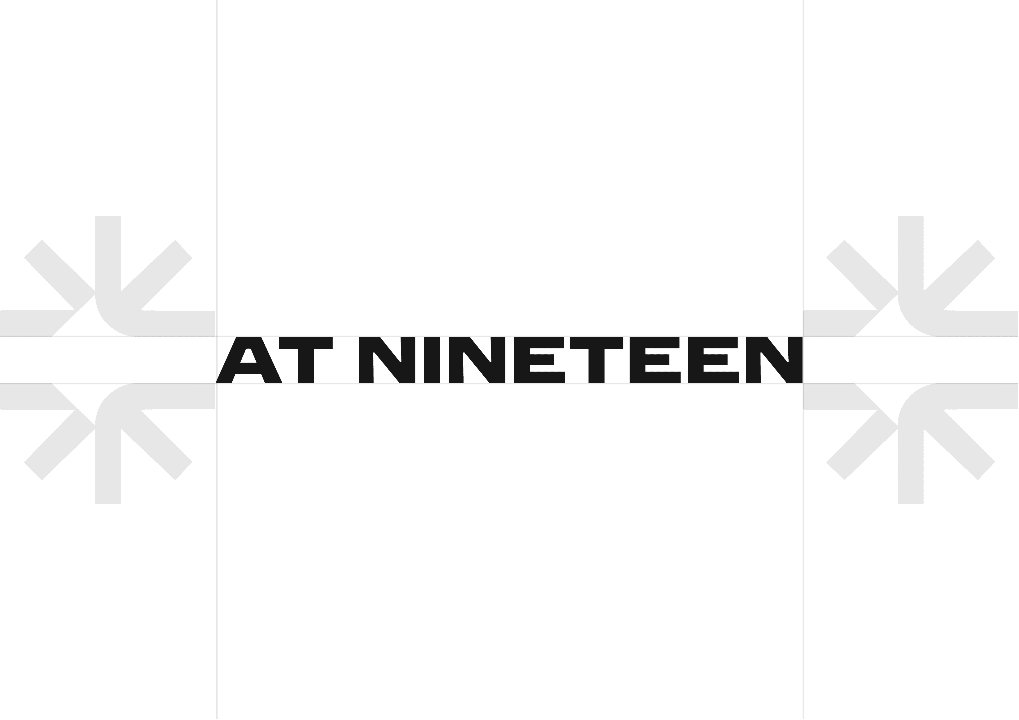
We lead with our wordmark as the hero of our identity. Our name and represents our brand culture, and this should be used as the 'logo'.

MINIMUM SIZE
This version is not intended for extremely small sizes. The minimum height is .75” for print applications and 50px for digital.
Clear Space
Clear space, or negative space, is the area that surrounds the wordmark, icons, or brand assets that is completely clear of any other graphical element. Clear space helps the wordmark stand out from the rest of the elements on the page and ensures legibility, even at small sizes. As a general rule, the more clear space, the better.
Colour Variations
Our logo can be used in our three primary colours, and the maximum contrast option should be applied in any given environment.
If you would like to use our logo outside of this approved palette, or in a partnership context that would alter the appearance of our brand please reach out to our brand team.