
Brand Colours
The brand colours of the AT NINETEEN™ identity are inspired by our location and lifestyle. This palette has been specifically designed to support the brand collateral as it 'ages up' or 'ages down' to meet our audience and should be applied with this in mind.
All of our brand colours are contrasting by nature and can be used interchangebly as both background or foreground colours.
Primary Colours
"BLACKOUT" [#171717] is our warm black, which slightly softens the harshness of our design system and allows the colour to be used both as a background as well as a foreground in certain applications.
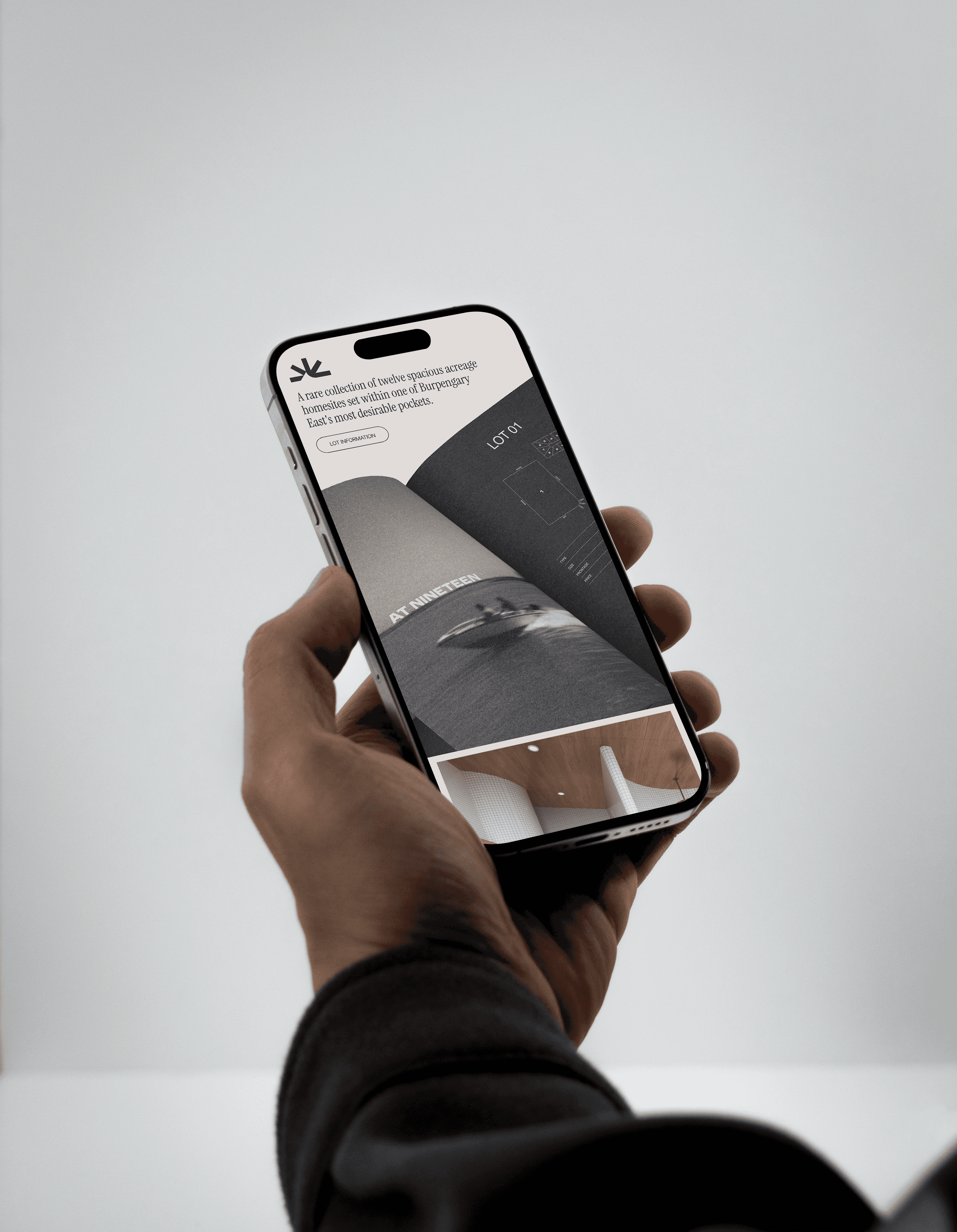
"MORETON WHITE" [#F2EEE5] is our primary light colour, it brings personality to our brand especially when used for text or graphics over imagery.
BLACKOUT
#171717
RGB (23,23,23)
CMYK (0,0,0,91)
MORETON WHITE
#F2EEE5
RGB (242, 238, 229)
CMYK (0, 2, 5, 5)
Secondary Colour
"LEGACY" [#202f27] is our deep-greenish brown. It speaks to the legacy element of our development and has a 'solid' feel to it. This colour should be applied anywhere we wish to look trusted, or established. It naturally lends itself to use as a background anytime we wish to drive a prestigious feeling presence.
LEGACY
#202F27
RGB (32, 47, 39)
CMYK (32, 0, 17, 82)
Brand Typeface
We use two primary fonts to communicate our message.
Instrument Serif
This is our primary typeface for headings, sentences, and body text where legibility, readability, and clarity is the priority. The minimum applied weight is 'light' with the maximum applied weight is 'semibold' and should predominantly be used in it's regular weight.
Using Type Rules
When constructing layouts, these tips will help you build interesting, and on-brand compositions with typography.
While these rules are proven and sound, sometimes we break these to best communicate in certain circumstances. Please contact our brand team if you wish to gain special use permission.
Stay Left Aligned
Legibility and clarity are vitally important to great typographical layouts. Since most people read from left to right, we should align our type accordingly.
Contrast is the name of the game when it comes to great design. When in doubt, skip a weight when pairing two weights, and double the size between two text elements.
Whenever you place text next to each other, either align the baselines (the line that the bottom of a lowercase x sits on) or align the x-heights (the top of a lowercase x). This helps align each line visually.
When setting paragraphs, to maintain clean and straight lines we must watch the ragged right edge. If the spacing unintentionally creates a weird looking shape, consider tweaking the language or resizing the container. Also, try to prevent single-word lines (orphans).
Negative space, or the space around elements is vitally important. That being said, if informational elements belong together, move them closer together. Use grouping wisely: just try not to cram too many things in one space!
It is easy for the user to get lost in long lines of text, and short ones are easily ignored. It’s best to keep lines between 45 and 70 characters long, depending on the size of the font. This will ensure legibility as the font sizes increase or decrease.